TreeView (tvw)
 | TreeView (tvw) - Allows you to display a hierarchy of nodes with parents and child. |
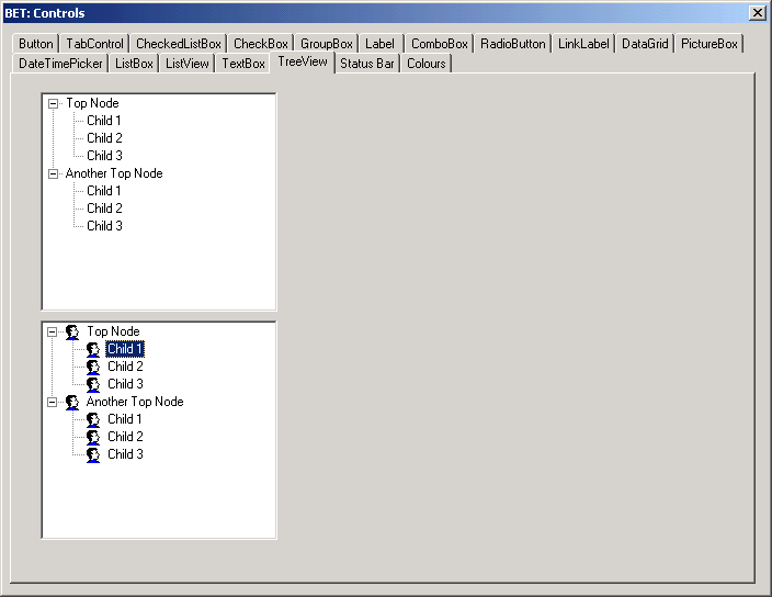
Examples
 |
What is a TreeNode ?
This is the object that represents an node of a TreeView.
Each TreeNode can contain a collection of other TreeNode objects.
To determine your location in a tree structure, use the FullPath property
The FullPath string can be parsed using the PathSeparator string value to determine where a TreeNode label begins and ends.
The TreeNode label is set by setting the Text property explicitly.
The label is displayed next to the TreeNode image, if one is displayed.
The Nodes collection holds all the child TreeNode objects assigned to the current TreeNode
You can add, remove, or clone a TreeNode; when doing so, all child tree nodes are added, removed, or cloned
Iterating Through a TreeView
Selecting specific tree nodes and iterating through the Nodes collection can be achieved by using the following property values: FirstNode, LastNode, NextNode, PrevNode, NextVisibleNode, PrevVisibleNode.
Assign the TreeNode returned by one of aforementioned properties to the TreeView.SelectedNode property to select that tree node in the TreeView control.
Tree node collections start at 0.
For inodecount = 0 To objParentNode.Nodes.Count - 1
   objnode = objParentNode.Nodes(inodecount)

    If objnode.Text >= sNodeText Then
        iinsertposition = inodecount
    Exit For

Next inodecount
Adding Nodes Manually
You can use the TreeNode Editor dialog box to add nodes to a treeview at design time.
Adding Nodes Programatically
When adding a large number of nodes you should place your code between the following two lines
TreeView.BeginUpdate
'add all the nodes
TreeView.EndUpdate
You can add nodes to a TreeView by adding TreeNode objects.
The constructor for this object can take the Text for the node, the image index and the selected image index.
Dim objnode as System.Windows.Forms.TreeNode
objnode = objParentNode.Nodes(inodecount)
Adding Images
To display images next to the tree nodes, assign an ImageList to the ImageList property of the parent TreeView control and assign an Image by referencing its index value in the ImageList property.
Set the ImageIndex property to the index value of the Image you want to display when the TreeNode is in an unselected state.
Likewise, set the SelectedImageIndex property to the index value of the Image you want to display when the TreeNode is selected.
Inserting Nodes
This inserts a new node after the first node
TreeView.Nodes.Insert(1, New TreeNode("Another root node")
Recursive function that stops when there is no parent
Private Function GetParentString(ByVal Node as TreeNode) As String
Dim suffix as string
If (node.Parent Is Nothing) Then
Return Node.Text
Else
If (Node.Nodes.Count = 0) Then
suffix = ""
else
suffix = "\"
end if
Return GetParentString(Node.Parent) + Node.Text + suffix
end if
End Function
Select a Node
Dim objtreenode As System.Windows.Forms.TreeNode
objtreeview.SelectedNode = objNodeToSelect
Selecting a Node with the Right Mouse button
A tree node is not selected by default when you select it with the right mouse button.
You can use the following event to explicitely select it when you use the right mouse button.
Private Sub tvwTreeView_MouseDown(ByVal sender As Object, _
                                  ByVal e As System.Windows.Forms.MouseEventArgs) _
                                  Handles tvwDiagram.MouseDown

   Dim objtreenode As System.Windows.Forms.TreeNode

   objtreenode = Me.tvwDiagram.GetNodeAt(e.X, e.Y)

   tvwTreeView.SelectedNode = objtreenode
End Sub
Expanding all the Tree Nodes
trvTreeView.ExpandAll
Expanding a particular Tree Nodes
You can expand a TreeNode by calling the Expand method
To expand all child tree node levels in the Nodes collection, call the ExpandAll method
Collapsing Tree Nodes
You can collapse the child TreeNode level by calling the Collapse method
You can also call the Toggle method to alternate the TreeNode between the expanded and collapsed states.
Using Images
Add an ImageList to the windows form
Create icons in the resource editor (32x32)
Add those icons to the ImageList
Link the ImageList to the Treeview
icon defaults - node selected - image position 0
icon defaults - node NOT selected - image position 1
include a link to Controls > ImageList (img)
CheckBoxes
Tree nodes can optionally display a check box
To display the check boxes, set the CheckBoxes property of the TreeView to true
The Checked property is set to true for tree nodes that are in a checked state.
Sorting
treeview1.sorted = true;
Properties - TreeView
| BackgroundImage | Gets or set the background image for the TreeView control. |
| BackgroundImageLayout | Gets or sets the layout of the background image for the TreeView control. |
| BorderStyle | Gets or sets the border style of the tree view control. |
| ForeColor | The current foreground color for this control, which is the color the control uses to draw its text. |
| FullRowSelect | Gets or sets a value indicating whether the selection highlight spans the width of the tree view control. |
| HideSelection | Gets or sets a value indicating whether the selected tree node remains highlighted even when the tree view has lost the focus. |
| HotTracking | Gets or sets a value indicating whether a tree node label takes on the appearance of a hyperlink as the mouse pointer passes over it. |
| ImageIndex | Gets or sets the image-list index value of the default image that is displayed by the tree nodes. |
| ImageKey | Gets or sets the key of the default image for each node in the TreeView control when it is in an unselected state. |
| ImageList | Gets or sets the ImageList that contains the Image objects used by the tree nodes. |
| Indent | Gets or sets the distance to indent each of the child tree node levels. |
| ItemHeight | Gets or sets the height of each tree node in the tree view control. |
| LabelEdit | Gets or sets a value indicating whether the label text of the tree nodes can be edited. |
| LineColor | Gets or sets the color of the lines connecting the nodes of the TreeView control. |
| Nodes | Gets the collection of tree nodes that are assigned to the tree view control. |
| Padding | Gets or sets the spacing between the TreeView control's contents and its edges. |
| PathSeparator | Gets or sets the delimiter string that the tree node path uses. |
| RightToLeftLayout | Gets or sets a value indicating whether the TreeView should be laid out from right-to-left. |
| Scrollable | Gets or sets a value indicating whether the tree view control displays scroll bars when they are needed. |
| SelectedImageIndex | Gets or sets the image list index value of the image that is displayed when a tree node is selected. |
| SelectedImageKey | Gets or sets the key of the default image shown when a TreeNode is in a selected state. |
| SelectedNode | Gets or sets the tree node that is currently selected in the tree view control. |
| ShowLines | Gets or sets a value indicating whether lines are drawn between tree nodes in the tree view control. |
| ShowNodeToolTips | Gets or sets a value indicating ToolTips are shown when the mouse pointer hovers over a TreeNode. |
| ShowPlusMinus | Gets or sets a value indicating whether plus-sign (+) and minus-sign (-) buttons are displayed next to tree nodes that contain child tree nodes. |
| ShowRootLines | Gets or sets a value indicating whether lines are drawn between the tree nodes that are at the root of the tree view. |
| Sorted | Gets or sets a value indicating whether the tree nodes in the tree view are sorted. |
| Text | Gets or sets the text of the TreeView. |
| TopNode | Gets or sets the first fully-visible tree node in the tree view control. |
| TreeViewNodeSorter | Gets or sets the implementation of IComparer to perform a custom sort of the TreeView nodes. |
| VisibleCount | Gets the number of tree nodes that can be fully visible in the tree view control. |
Properties - Node
| BackColor | Gets or sets the background color of the tree node. |
| Bounds | Gets the bounds of the tree node. |
| Checked | Gets or sets a value indicating whether the tree node is in a checked state. |
| ContextMenu | Gets the shortcut menu associated with this tree node. |
| ContextMenuStrip | Gets or sets the shortcut menu associated with this tree node. |
| FirstNode | Gets the first child tree node in the tree node collection. |
| ForeColor | Gets or sets the foreground color of the tree node. |
| FullPath | Gets the path from the root tree node to the current tree node. |
| Handle | Gets the handle of the tree node. |
| ImageIndex | Gets or sets the image list index value of the image displayed when the tree node is in the unselected state. |
| ImageKey | Gets or sets the key for the image associated with this tree node when the node is in an unselected state. |
| Index | Gets the position of the tree node in the tree node collection. |
| IsEditing | Gets a value indicating whether the tree node is in an editable state. |
| IsExpanded | Gets a value indicating whether the tree node is in the expanded state. |
| IsSelected | Gets a value indicating whether the tree node is in the selected state. |
| IsVisible | Gets a value indicating whether the tree node is visible or partially visible. |
| LastNode | Gets the last child tree node. |
| Level | Gets the zero-based depth of the tree node in the TreeView control. |
| Name | Gets or sets the name of the tree node. |
| NextNode | Gets the next sibling tree node. |
| NextVisibleNode | Gets the next visible tree node. |
| NodeFont | Gets or sets the font used to display the text on the tree node's label. |
| Nodes | Gets the collection of TreeNode objects assigned to the current tree node. |
| Parent | Gets the parent tree node of the current tree node. |
| PrevNode | Gets the previous sibling tree node. |
| PrevVisibleNode | Gets the previous visible tree node. |
| SelectedImageIndex | Gets or sets the image list index value of the image that is displayed when the tree node is in the selected state. |
| SelectedImageKey | Gets or sets the key of the image displayed in the tree node when it is in a selected state. |
| StateImageIndex | Gets or sets the index of the image used to indicate the state of the TreeNode when the parent TreeView has its CheckBoxes property set to false. |
| StateImageKey | Gets or sets the key of the image used to indicate the state of the TreeNode when the parent TreeView has its CheckBoxes property set to false. |
| Tag | Gets or sets the object that contains data about the tree node. |
| Text | Gets or sets the text displayed in the label of the tree node. |
| ToolTipText | Gets or sets the text that appears when the mouse pointer hovers over a TreeNode. |
| TreeView | Gets the parent tree view that the tree node is assigned to. |
Methods - Node
| BeginEdit | Initiates the editing of the tree node label. |
| Clone | Copies the tree node and the entire subtree rooted at this tree node. |
| Collapse | Collapses the TreeNode. |
| EndEdit | Ends the editing of the tree node label. |
| EnsureVisible | Ensures that the tree node is visible, expanding tree nodes and scrolling the tree view control as necessary. |
| Expand | Expands the tree node. |
| ExpandAll | Expands all the child tree nodes. |
| FromHandle | Returns the tree node with the specified handle and assigned to the specified tree view control. |
| GetNodeCount | Returns the number of child tree nodes. |
| Remove | Removes the current tree node from the tree view control. |
| Toggle | Toggles the tree node to either the expanded or collapsed state. |
Methods - TreeView
| BeginUpdate | Disables any redrawing of the tree view. |
| CollapseAll | Collapses all the tree nodes. |
| EndUpdate | Enables the redrawing of the tree view. |
| ExpandAll | Expands all the tree nodes. |
| GetNodeAt | Retrieves the tree node that is at the specified location. |
| GetNodeCount | Retrieves the number of tree nodes, optionally including those in all subtrees, assigned to the tree view control. |
| HitTest | Provides node information, given a point. |
| Sort | Sorts the items in TreeView control. |
Events
| AfterCheck | Occurs after the tree node check box is checked. |
| AfterCollapse | Occurs after the tree node is collapsed. |
| AfterExpand | Occurs after the tree node is expanded. |
| AfterLabelEdit | Occurs after the tree node label text is edited. |
| AfterSelect | Occurs after the tree node is selected. |
| BackgroundImageChanged | Occurs when the BackgroundImage property changes. |
| BackgroundImageLayoutChanged | Occurs when the BackgroundImageLayout property changes. |
| BeforeCheck | Occurs before the tree node check box is checked. |
| BeforeCollapse | Occurs before the tree node is collapsed. |
| BeforeExpand | Occurs before the tree node is expanded. |
| BeforeLabelEdit | Occurs before the tree node label text is edited. |
| BeforeSelect | Occurs before the tree node is selected. |
| ItemDrag | Occurs when the user begins dragging a node. |
| NodeMouseClick | Occurs when the user clicks a TreeNode with the mouse. |
| NodeMouseDoubleClick | Occurs when the user double-clicks a TreeNode with the mouse. |
| NodeMouseHover | Occurs when the mouse hovers over a TreeNode. |
| PaddingChanged | Occurs when the value of the Padding property changes. |
| Paint | Occurs when the TreeView is drawn. |
| RightToLeftLayoutChanged | Occurs when the value of the RightToLeftLayout property changes. |
| TextChanged | Occurs when the Text property changes. |
© 2024 Better Solutions Limited. All Rights Reserved. © 2024 Better Solutions Limited TopPrevNext