Adding Broken Axis
Chart axes in Excel can either be linear or logarithm.
If you want to show two different scales on the same axis this can be achieved by using a combination chart.
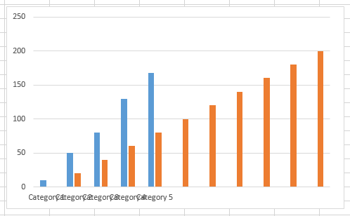
Lets consider the following data
We would like to plot the following values:
0 to 100 in steps of 20 and
100 to 1000 in steps of 200
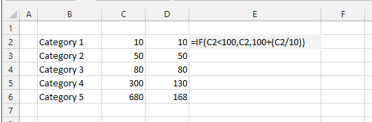 |
First lets adjust the values that will actually be plotted
Our final chart will have an actual scale of 0 to 200 so lets calculate the corresponding values for Category 4 and Category 5
These values have been calculated in Column D
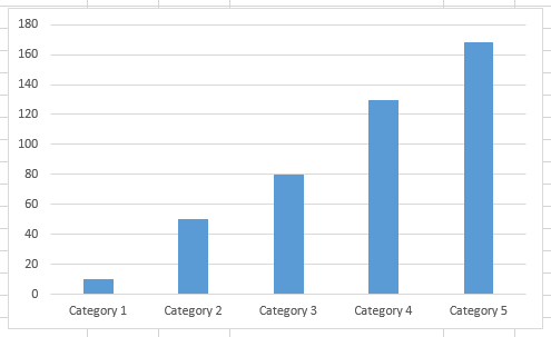
Lets create a column chart showing this data
 |
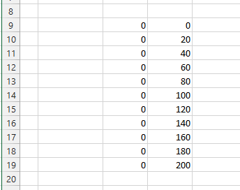
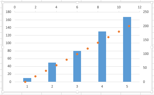
Next lets create the source data for an XY Scatter chart which we will use to display our broken axis
 |
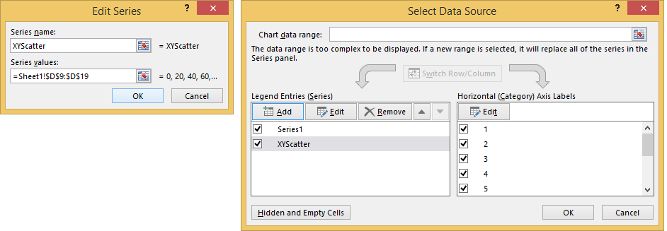
Lets add another column to your clustered column chart.
Select the chart, select "Select Data"
Add, Series Name = "XYScatter"
Values = {0,,,,,200}
 |
This additional column will be added to the chart
 |
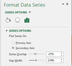
Lets now switch this series to a secondary horizontal and vertical axis
Select the series, right click Format Data Series
Secondary Axis
 |
Press Close
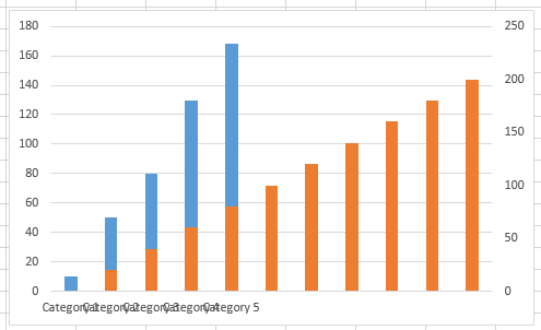 |
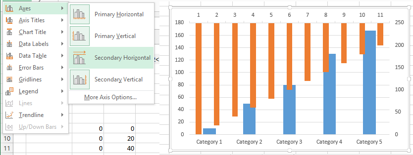
Chart Tools Design tab, Add Chart Element
Secondary Horizontal Axis - Show left to right axis
 |
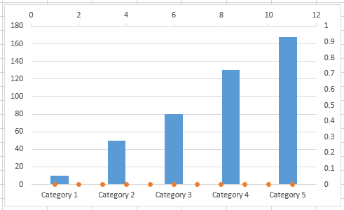
We now need to change this series into an XY Scatter chart type
Select the series, Insert > Scatter > XY Scatter)
 |
Select the series, right click, Select Data
Choose "XYScatter" press Edit
Change the values all to zero {0,0,0,0,0,0}
 |
Select the Secondary vertical axis and change the scale from 0 to 200
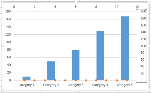 |
Select the XYScatter series, right click add data labels overrite the top 5 data labels with the values 1000,800,600,400,200
SS
Select the primary (left) vertical axis
Format Axis, axis options - axis labels - None
SS
Click on data labels
Format, Label position = Left
and reduce the plot area to allow for the data labels to automatically display on the left of the vertical line
This now resembles a broken axis
SS
Click on the Format data series
marker options - marker type - None
SS
Click on the Secondary (top) horizontal axis
Format axis, axis options - axis labels - None
Major tick mark type - None
SS
Click on the Secondary (right) vertical axis
format axis - axis options - axis labels none
Major tick mark type - None
SS
select the legend and press Delete
© 2024 Better Solutions Limited. All Rights Reserved. © 2024 Better Solutions Limited TopPrevNext