Histogram
Added in 2016
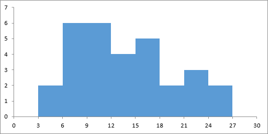
If the data values are continous it makes sense to display a sequence of numbers on the x-axis indicating the inclusive upper bound for each interval. ??
https://support.office.com/en-gb/article/Create-a-histogram-85680173-064b-4024-b39d-80f17ff2f4e8?ui=en-US&rs=en-GB&ad=GB
Alternative
 |
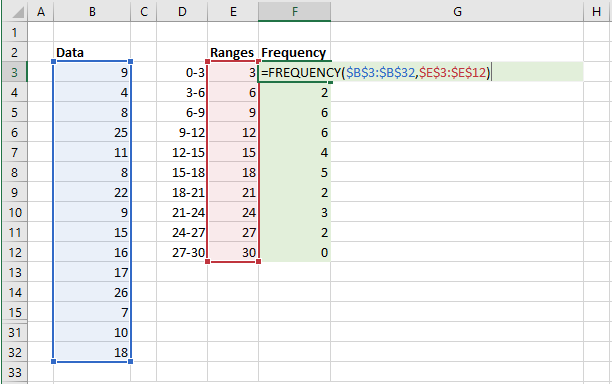
Start with a list of values, 30 random values between 1 and 30 (B3:B32).
Create a table with 3 columns, Range, Upper, Frequency (D2:F12).
In the first column (D) add the ranges which you would like displayed on your histogram. We are going to use blocks of 3: 0-3, 3-6, 6-9, etc
In the second column (E) add the numerical value which is the largest in each range: 3, 6, 9, 12 etc
In the third column (F) use the FREQUENCY function to add an array formula to return the frequency of each range.
 |
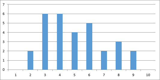
Step 1 - Create Clustered Column Chart
Select the cells F3:F12 and create a Clustered Column Chart
 |
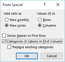
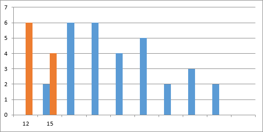
Step 2 - Add Another Series
Select cells "E6:F7" from the middle of the data range
Select Copy
Click on the Chart Area
Click on the Paste drop-down and select Paste Special. This will display the following dialog box.
Select "Categories (X Labels) in First Column
 |
 |
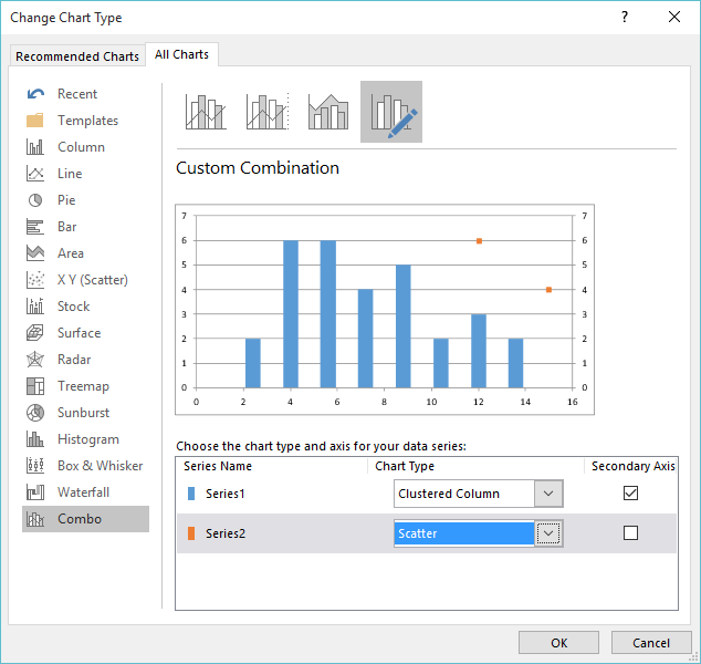
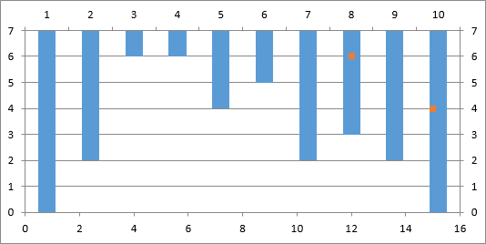
Step 3 - Change Chart Series Types
Click on either of the chart series and right mouse click.
Select Change Series Chart Type Change to display the Change Chart Type dialog box.
Change series 1 to be on Seconday Axis
Change series 2 to be an XY Scatter chart type
 |
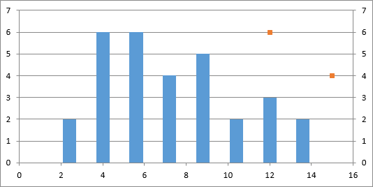 |
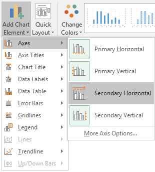
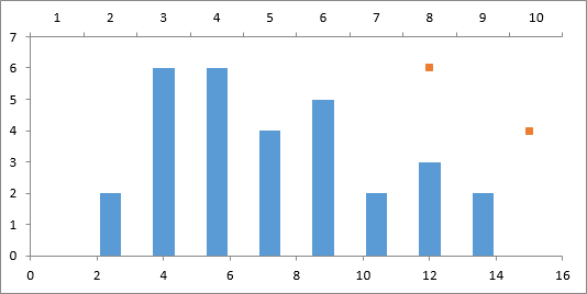
Step 4 - Add Secondary Horizontal Axis
Select the Chart Tools, Design Tab, Add Chart Element, Axes, Secondary Horizontal
This will invert the chart
 |
 |
Step 5 - Remove Secondary Vertical Axis
Select the Chart Tools, Design Tab, Add Chart Element, Axes, Secondary Vertical
Unselect Secondary Vertical to remove the secondary vertical axis
Remove the horizontal gridlines
Click on the gridlines and press Delete.
 |
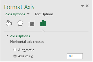
Step 6 - Cross Axis at Zero
Change the secondary axis to cross at 0
Select the vertical (Value) axis and right mouse click.
Select Format Axis Change
Display the Axis Options and change the "Horizontal axis crosses, axis value" to 0
 |
 |
Step 7 - Remove the Secondary Horizontal Axis
Select the Chart Tools, Design Tab, Add Chart Element, Axes, Secondary Vertical
Unselect Secondary Horizontal to remove the secondary horizontal axis
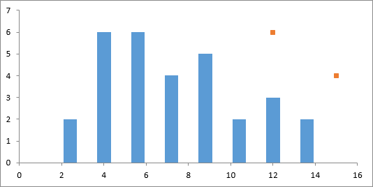 |
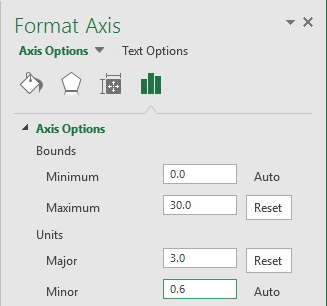
Step 8 - Change Horizontal Axis Scale
Select the horizontal (Value) axis and right mouse click
Select Format Axis to display the Axis Options
Change the Minimum = 0, Maximum = 30 and Major = 3 (this is the interval width)
 |
 |
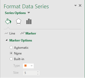
Step 9 - Hide Scatter Line Markers
Select the scatter markers and right mouse click
Select Format Data Series to display the Series Options
Select the "Fill & Line" options and expand the Marker Options Marker Options, select None
 |
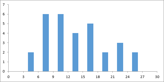 |
Step 10 - Remove Bar Gaps
Remove the gaps between the bars
Click on one of the columns and select Format Data Series Series Options, change the gap width to "0"
|
© 2024 Better Solutions Limited. All Rights Reserved. © 2024 Better Solutions Limited TopPrevNext