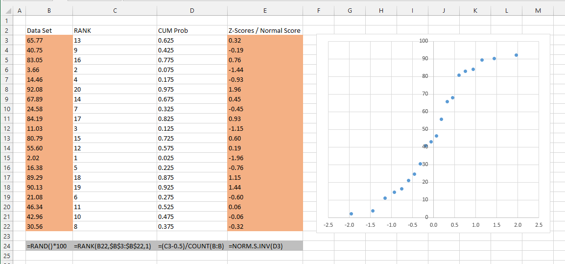
Normal Probability Plot
Also known as Normal Test Plot, Normal Quantile Plot, Normal Plot, P-P Plot
This type of chart is not included.
The chart that is created from the Analysis ToolPak Regression dialog box is in fact a Cumulative Distribution of the dependent variable and not a normal probability plot
SS
This is a chart that indicates whether a data set is approximately normally distributed
The data is plotted in a way that the points should form an approximate straight line
1) Determine the sample size
2) Create a table of the data in ascending order
3) Number the data in an ordered list (using RANK function)
4) Calculate the cumulative probabilities [ (I - 0.5) / n ] for I - 1,2, n (formula for an even sample)
This type of chart can be used to determine if a set of data follows a normal distribution.
The idea is that you plot the actual z-scores on the x-axis against the z-scores taken from an equivalent normal distribution.
One characteristic of a Normal distribution is that any normally distributed data will have the same amount of curve area between each point.
We can obtain the amount of curve area between two sample points by using the cumulative distribution function.
The cumulative distribution function returns the total under the curve to the left of that point.
CDF = NORM.S.DIST(value, mean, stedev, true)
 |
© 2024 Better Solutions Limited. All Rights Reserved. © 2024 Better Solutions Limited TopPrevNext