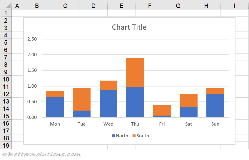
Charts
A chart is just a graphical representation of some numbers and the scientists and engineers among us often refer to charts as graphs.
The two terms refer to the same thing and throughout this website we will use the term chart.
Information is often easier to absorb when it is presented graphically and charts are often used to emphasize the relationship between certain data values.
Displaying your data graphically can make it easier to spot patterns and trends in your data.
Before you can create a chart you must have some data on your worksheet.
 |
Static Charts
This is a chart that has been unlinked from its data range. This can be done in 2 ways
1) convert it to a picture
2) convert the range references to arrays
Axes
A chart can have zero, one, two, three or four axes and any of them can be hidden
Formatting
To quickly remove all formatting from the plot area, select the plot area and press Delete
Chart Tips
When you move the mouse over a chart element, a small chart tip is displayed
ToolTips
Holding your mouse over different parts of a chart should display a tooltip text which tells you which element you are over.
SS
If there are no tooltips displayed then check your (Excel Options, Advanced tab)(Chart "Show chart element names on hover")
SS
On-Chart Customisation Buttons
In 2013 three new buttons were introduced that appear next to your charts.
These buttons appear automatically when a chart is selected.
The first button allows you to quickly add, remove or change the chart elements that are displayed on a chart
SS
This idea is similar to the Mini Toolbar and provides you with direct access to these commands without having to return to the ribbon tab. Similar to a shortcut menu.
SS
This list automatically changes based on the chart type
This feature also supports Live Preview
Important
Charts are dynamic meaning that the data on your worksheet is linked to the chart. If the numbers on your worksheet change then the chart will be updated automatically.
Charts let you visually illustrate the relationship between different items.
If you want to chart a whole block of data you only need to select one of the cells before starting the Chart Wizard. The current region will be selected automatically.
© 2024 Better Solutions Limited. All Rights Reserved. © 2024 Better Solutions Limited TopNext