Combination
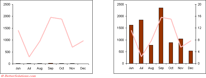
This chart contains 2 data series, a line series and a column series.
The two series have also been plotted on different axes.
Create the default chart.
Change the 2nd series to a line
Select the individual series and select (Chart > Chart Type)
Change the chart type to a line.
Notice that the other series remains as a column.
When two series are plotted on different axes the axes are scaled independently
When you use two axes you must ensure that you indicate which series is plotted on which axis
Move the series to the other axis
2D charts can actually have two axes.
When a chart have more than one series you can choose which axis is ised for each series.
Double click on the series and select Axis tab.
When you select to include a secondary sxis you will only get a second Y-axis added to the chart.
You can change the Chart Options to select whatever combination of priomary and secondary axes you want
Combination Charts
It is possible to create charts that apply different chart types to different data series.
For example you might want to display one series as a row of columns and another as a line.
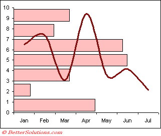 |
This type of chart is known as a combination chart, since it contains a combination of chart types.
Combining different chart types on the same chart lets you display more complicated data.
How can I create a Combination Chart ?
To create a chart with a combination of chart types you must first create the chart with a single chart type.
Select the individual data series and select (Format > Chart Type).
You can select an individual series and change the chart type of just that particular series.
You can create combination charts which contain two or more different chart types. For example a chart that has a bar series and a line series. Not all chart types can be used in a combination chart.
You can change the chart type for an individual series by selecting the series instead of the chart area.
To include more than one chart type in a chart, click a data series and change its chart type (Chart > Chart Type).
This allows you to add (and save) your custom chart types as well as formatting ??
The legend will normally reflect any changes made to the chart types.
There are some chart types that you cannot combine on the same chart
Bar and Column charts
2D and 3D charts
An error message will be displayed if you try and combine 2 chart types that are not compatible.
If you have used a combination chart to plot different data series against different scales on two axes, it is always a good idea to indicate which series goes with which axes.
You could colour each axes the same colour as the corresponding data series.
Adding a Second Axis
When the values for two data series are very different it is impossible to find a scale that suits both.
It is often useful to add a second axis to your chart when you use a combination of chart types.
This can help to identify individual values.
A chart that contain two axes is a simple example of a combination chart.
To add a secondary axis, choose (Chart Options, Axes tab) and tick the relevant check box.
 |
Important
You cannot mix 2 dimensional charts and 3 dimensional charts on the same chart.
Some chart types do not have axes, for example pie charts and doughnut charts.
It is possible to change the chart type to a custom chart type which has an option for a "Chart on 2 axes" although a more general approach is to use the "??" dialog box.
Excel does not support 3D combination charts.
© 2024 Better Solutions Limited. All Rights Reserved. © 2024 Better Solutions Limited TopPrevNext