Highlight End Points
??
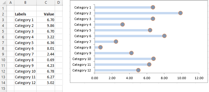 |
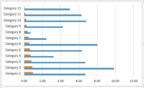
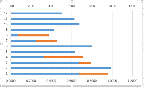
Step 1 - 2D Clustered Bar Chart
Select cells "B2:C14" and create a 2D Clustered Bar Chart
Remove the Title and the Legend
 |
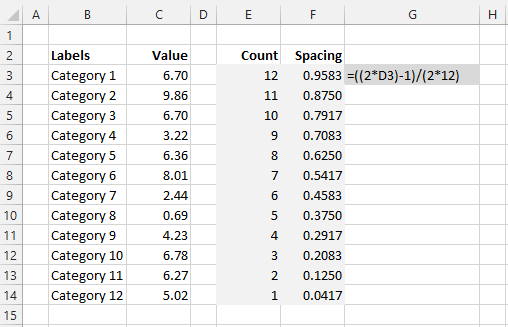
Step 2 - Two Extra Columns
Create two additional columns. One called "Count" and the other called "Spacing"
The Count column contains a count of the number of items, starting at 1.
The Spacing column contains an evenly distributed number of points between 0 and 1.
We have 12 points so we need 12 equal points distributed between 0 and 1
 |
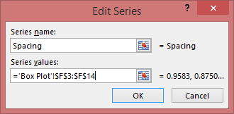
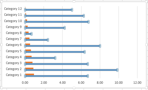
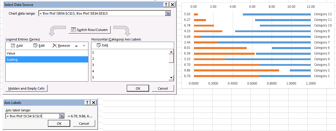
Step 3 - Additional Series
Add another series to this chart containing the "Spacing" column
Click on the chart and select "Select Data"
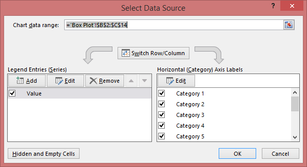 |
Click "Add" and add the following range
Select cells "D15:D26" for the series value
 |
 |
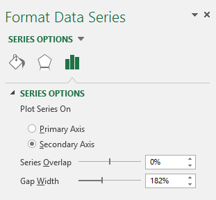
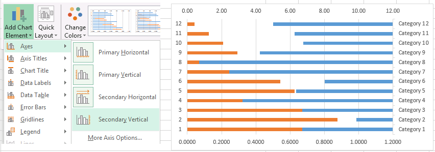
Step 4 - Move the Value series to the Secondary Axis
Click on the 'Value' series and right mouse click, select "Format Data Series"
 |
Under the Series Options
Change the "Plot Series On" to secondary axis
 |
 |
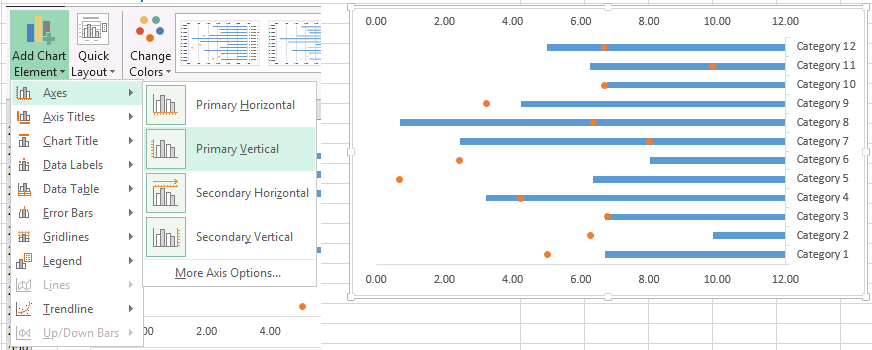
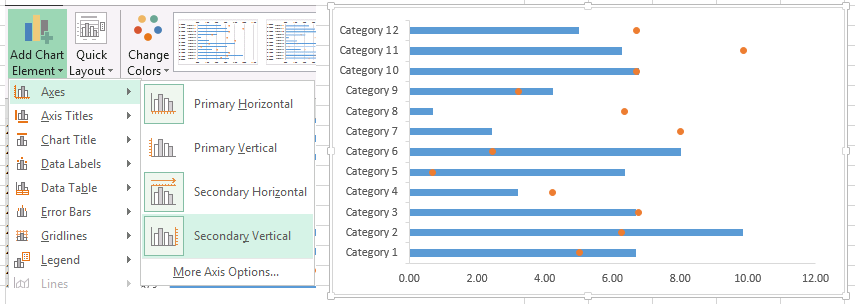
Step 5 - Display the Y-axis for the secondary axis
Click on the chart, select the Value series and click the Chart Tools - Design tab.
Select Add Chart Element > Axes > Secondary Vertical
 |
Step 6 - Add the correct series labels for the "Value" series
Click on the chart and select "Select Data"
Select the "Scaling" series on the left and press the Edit button on the right hand side (underneath Horizonal Axis labels)
Select cells "C15:C26" for the series value
 |
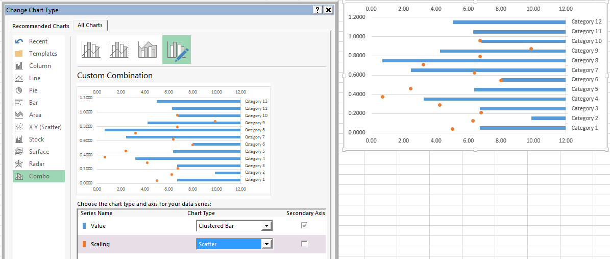
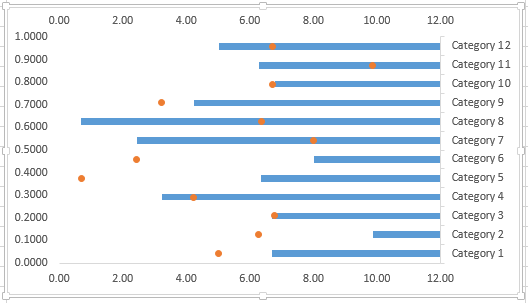
Step 7 - Change the chart type of the "Scaling" series to XY Scatter
Click on the Value series and right mouse click, select "Change Series Chart Type"
 |
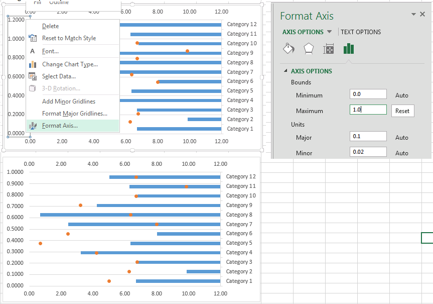
Step 8 - Change the primary axis scale to be from 0 to 1
??
 |
Step 9 - Hide the gridlines on the primary axis
Click on the gridlines and press Delete
 |
Step 10 - Hide the "Vertical" primary axis
Click on the chart and select the Chart Tools - Design tab.
Click on Axes > Primary Vertical Axis and select "None"
 |
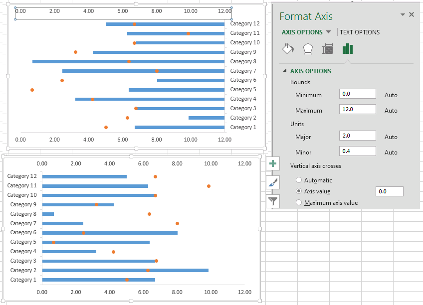
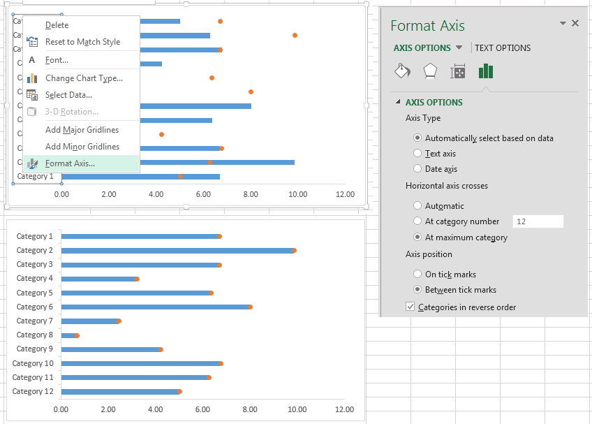
Step 11 - Move the Secondary Vertical axis to the left hand side
Click on the chart and select the secondary horizontal axis
Right mouse button, select "Format Axis"
Change the "Vertical axis crosses" to Axis value and enter the value 0.
 |
Step 12 - Hide the "Horizontal" secondary axis
Click on the chart and select the Chart Tools - Design tab.
Click on Add Chart Element > Axes > Secondary Vertical
For some reason these axes are back to front
 |
Step 13 - Reverse the category labels for the "Value" series
Click on the horizontal axis and select Format Axis
 |
Change the formatting accordingly
© 2026 Better Solutions Limited. All Rights Reserved. © 2026 Better Solutions Limited TopPrevNext