Chart Elements
The different parts that make up a chart are referred to as chart elements.
Most of the items on a chart can be repositioned by clicking on an item and dragging it with the right mouse button.
The black handles also indicate that the item could be moved, resized and formatted.
All of these chart items (except the chart area) once selected can be moved around and resized relative to other items.
If you have a pie chart with a really small segment you can select this segment and drag it away from the pie chart to create an expanded pie chart ??
Each chart element can have its own formatting using the Formatting Task Pane
Chart Option Button
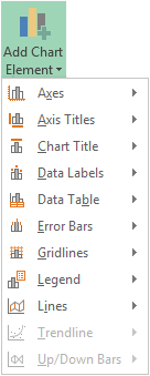
The first option button is Chart Elements
SS
Provides quick access to the most common commands.
If you need more options click on More Options at the bottom to display the task pane
Add Chart Elements
 |
Selecting Chart Elements
Clicking on a chart element will select that specific object within the chart. To select the actual chart object, hold down Ctrl when you select the chart.
You can use the "Current Selection" group on the Format Tab to select the different elements on a chart
SS
Small black handles appear around the perimeter of an object to indicate that it has been selected.
You can also use the mouse to select different elements.
For simple charts using the mouse is quicker, however for more advanced charts using the Ribbon Tab is often easier.
Chart Elements - Category Axis, Category Axis Title, Chart Area, Chart Title, Corners, Data Label, Data Labels, Data Table, Display Units Label, Down-Bars, Drop Lines, Error Bars, Floor, Gridlines, High-Low-Lines, Legend, Legend ENtry, Legend Key, Plot Area, Point, Secondary Category Axis, Secondary Category Axis Title, Secondary Value Axis, Secondary Value Axis Title, Series, Series Axis, Series Line, Trendline, Trendline Equation, Up-Bars, Value Axis Title, Value Axis, Walls
Chart Area
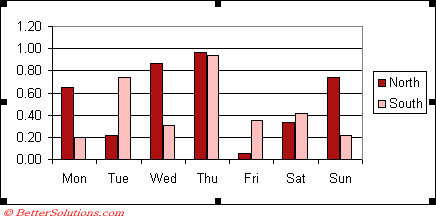
The chart area is everything within the outside border.
This is the area that makes up the chart. All charts have a chart area. This includes the plot area and the space outside it.
You need to select the chart area when you want to make changes to the whole chart (i.e. changing the font size displayed on all the chart items).
All charts have a chart area
 |
Plot Area
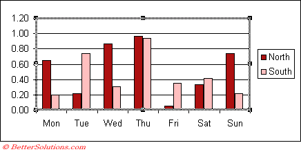
The plot area is the area which is enclosed by the two axis. This area can have its own border as well as a background colour.
The plot area is everything enclosed by the axes. This does not include titles, legend, etc.
This is the area enclosed by the two axes. All charts have a plot area. For 3D charts, the plot area can enclose the chart axes and axes titles.
All charts have a plot area
 |
Data Marker
Is a piece of data plotted on a chart, normally corresponds to the data in a single cell. This can be a column value, bar, slice, cross or square depending on the type of the chart.
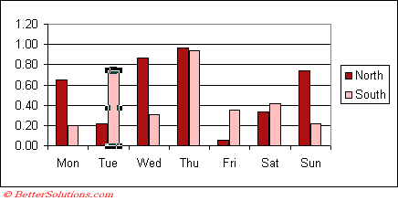
Data Point
These are used to identify individual data points on the series on a chart. Custom and Automatic.
 |
Data Series
A data series is a collection of data points (or markers) and normally corresponds to the data within a single row or column. This could be a series of columns, bars or a series of squares or crosses joined together by a line.
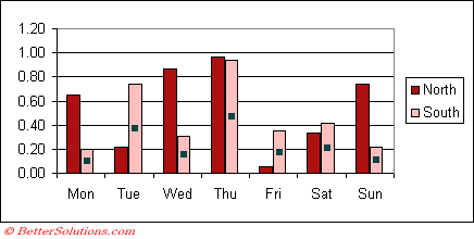 |
As you hover over a particular data point on a chart a screen tip will display the value of that data point. If not then check your (Tools > Options)(Chart tab, "Show Values").
This is always the vertical axis.
Chart Layouts
Chart Layouts in Excel are pre-built combinations of chart elements (titles, legends, gridlines, data labels, axes, backgrounds, etc.) that you can apply to a chart with a single click.
They don't change the chart type, they change the presentation of the chart.
Axes
Category X Axis - This is a line along which labels for the chart's categories are arranged. Categories are individual measurements intervals or groupings for the original data. In column charts, the category axis is the horizontal line along the bottom.
Value Y Axis - This is vertical for column charts.
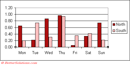 |
The X axis or category axis is always the horizontal axis along the bottom of your chart
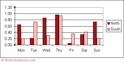 |
The Y axis or value axis is always the vertical axis which is usually on the left of your chart.
Axis Titles
Category X Axis Title - (Not all chart types) This can be used to display a title below the x-axis.
Value Y Axis Title - (Not all chart types) This can be used to display a title on the left of the y-axis.
Chart Title
This can contain a summary or short description of the chart.
Data Labels
You can connect the data point to the data label by using a leader line.
You can change the data label shape, right click and choose Change Data Label Shape
You can change the data label fill using the Format Data Labels task pane.
Data Label Position
| Column | Column Stacked | Line | Pie | Bar | Bar Stacked | Area | XY | Stock | Surface | Radar | |
| Center | Y | Y | Y | Y | Y | Y | No | No | |||
| Inside End | Y | Y | Y | Y | |||||||
| Inside Base | Y | Y | Y | Y | |||||||
| Outside End | Y | Y | Y | Y | |||||||
| Left | Y | Y | |||||||||
| Right | Y | Y | |||||||||
| Above | Y | Y | |||||||||
| Below | Y | Y | |||||||||
| Best Fit | Y |
Data Table
A grid that appears in the chart displaying the exact data that is used to create the chart.
Can only be used with a few chart types
You cannot use a datatable with the following chart types: xy scatter, pie, doughnut, radar, bubble and surface
It is not possible to apply different font formatting to individual cells and rows
You can only format the borders, not the patterns
when you add a datatable the table replaces the axis labels on the horizontal axis
The first row of the datatable contains these labels
You cannot apply separate formatting to the axis labels they will have the same formatting as the rest of the datatable.
If you are using bar charts or charts with time-scale cetagory axis then the data table is positioned below the chart and does not replace the axis labels.
Error Bars
These can be used to display additional information, for example the amount of error or uncertainty with each data point.
2003 - On the X Error Bars tab or the Y Error Bars tab
Error bars are usually used in statistical or scientific data
Error bars show potential error or degree of uncertainty relative to each data marker in a series
Error bars express potential error amounts that are graphically relative to each data point
or data marker in a data series.
For example, you could show 5 percent positive and negative potential error amounts in the results of a scientific experiment:
You can add error bars to data series in a 2-D area, bar, column, line, xy (scatter), and bubble charts. For xy (scatter) and bubble charts, you can display error bars for the x values, the y values, or both.
The direction of the error bars depends on the chart type of your chart. For scatter charts, both horizontal and vertical error bars are displayed by default.
You can remove either of these error bars by selecting them, and then pressing DELETE.
To add error bars (for the Y values in an X-Y chart):
Add two columns (or rows) alongside your data; one column contains the value for error above each data point, the second column contains the value for error below each point.
Right-click the data series in your chart and choose Format Data Series
Go to the Y Error Bars tab
Select the Custom radio button
Point the + field to your column of error above values
Point the - field to your column of error below values
These can be added to either or both axes
Gridlines
These are just extensions of the axes scale which can help make it easier to estimate the value of specific data points. These can be both horizontal and vertical.
Legend
This is used to identify the different data series on a chart.
Lines
Up/Down Bars
Chart Properties
Chart Area
SS
Move and size with cells -
Move but don't size with cells -
Don't move or size with cells -
Print Object -
Locked -
Lock Text -
© 2026 Better Solutions Limited. All Rights Reserved. © 2026 Better Solutions Limited TopPrevNext