Advanced
Registry Fix
this fixes copyng excel tables into word ??
hKEY_CURRENT_USER\Software\Microsoft\Office\11.0\Excel\Options
Type FontSub - DWORD - 0
Make sure that your default for sizes is set to cm and not to points - where ??
You can have multiple charts on chart sheets, although you can only modify one chart at a time.
Delete labels and insert again. Source data doesn't make a different when you drag it from different sizes.
Dragging Titles
Drag the chart title to the new location
There is a slight inconsistency, normally when you are dragging an object, the mouse pointer turns into a four-headed arrow but in this case it remains as a large open arrow
An object is selected when it is outlined with solid squares and its name shows in the Name box
PivotTable / Chart
Chart > Source Data to change the data source to point to a PivotTable to create a PivotChart
After creating your pivotchart you cannot switch the data source back to an ordinary worksheet
You can only undo.
Paste Special
Edit > Paste Special
Add Cells as New Series
Values of Y in Columns
SS
Data Consequences
Any source data that contains 'N/A or is in any hidden rows or columns will not be plotted. Empty text strings or zero values are plotted ??
By default charts will plot any blank cells and your series will contain gaps. You can either treat the blanks as zeros or interpolate the data by joining the lines together. This can be changed (Tools > Options)(Chart tab, "????"). They can easily be interpolated by entering "=NA()" into the blank cells.
| #N/A | Prevent the point from being plotted (interpolated) |
| Empty cell | Takes the value to be zero |
| Blank label | Breaks the line up |
| Blank row | Breaks the series up |
| Hidden row | These are not plotted |
| Non value (i.e. text) | Treated as zero |
Category Labels and Values can be any of the following types:
| String | The label |
| Array | {10,20,30,40,50} |
| Continuous Range | Range("A4:D4") |
| Non Contiguous Range | Range("A4:D4") , Range("C4:C4") |
| Empty |
If you have a chart that has source data in any hidden rows then by default this data will not be plotted. You can change this in (Tools > Options) (Chart tab, plot visible cells only).
To name charts click on the arrow on the formatting toolbar or hold down Ctrl and select the chart - then define a name in the normal way.
Deleting source data will cause your chart to update automatically. You can delete rows (Edit > Delete) ??
Be aware that you can have a valid Series Formula with no category labels as long as the series is not the first and the category labels are defined in another series
Source Data - Non Contiguous
It is possible to chart a discontinuous range by holding down the Ctrl key to select the range before pressing F11.
You can hold down the Ctrl key to select those cells before displaying the chart wizard.
A range reference can consist of a non-contiguous range. The argument must be in brackets with each range separated by a comma
Source Data - Arrays
When you define your series source data for the values and labels, you can just type the array directly into the range reference in the format. Source data can be a non-contiguous range.
SS
Source Data - Different Worksheets
Your data will normally all be on the same worksheet, although it is possible to have the data corresponding to different series on different worksheets, or even in different workbooks.
This is not receommended but is it possible for a chart to get its source data from multiple worksheets (or even different workbooks). A single chart can use data that is stored on different worksheets and can even use data from different workbooks.
Source Data - Different Workbooks
If a chart source data is not in the same workbook as the chart or is not in an opened workbook then the series data cannot be changed in any way. Including the name of the series. This may arise when copying worksheets containing charts that are referencing other worksheets.
Chart Restrictions
You can display as many as 255 different data series on one chart (except Pie Charts).
All 2D charts can display up to 32,000 individual data points.
All 3D charts can display up to 4,000 individual data points.
A chart cannot display more than 256,000 data points (in total).
The number of charts you can put on a single worksheet (or within a workbook) is only limited by the memory available.
More Chart Commands
There are several other chart related commands that are not displayed on any toolbars by default but might be useful in some circumstances.
These can be accessed from the (Tools > Customise) dialog box and include:
You can quickly copy a series by highlighting the series formula and pasting it onto the Plot Area.
You can give charts meaningful names by selecting the chart and typing the name directly into the Name box. To change the name of an existing chart you must also use the Name box.
You can represent an unlinked chart by copying and pasting it as a picture. Hold down Shift and press (Edit > Copy Picture). Select "as shown on screen" and the "picture" format. This is useful when you are copying into another application.
If your chart contains data series that have different scales then consider plotting them on separate axes.
You can select a chart by holding down Ctrl while you select it with the mouse ??
Can you have several charts on a chart sheet ???
Dynamic Ranges
You can create dynamic ranges for your source data. Define a named range containing the formula "=OFFSET(B2,0,0,COUNTA(B:B)-1)" where B2 is the start of your data.
You can unlink a chart from its source data without losing the ability to edit the chart. Click in the formula bar and press F9 (or Ctrl and the "=" key). The range will be converted to a literal array. You can convert part of the series formula by highlighting it first before pressing F9.
You can add an extra series of data onto an existing chart by either dragging the coloured range finder or by copying & pasting the data on top of the chart ??
You can unlink chart series from its data range so the chart does not update. You just have to convert the range reference to an array. Select the chart series in the formula bar and press F9. Repeat this action for all series.
Numeric Category Labels
If you normally highlight your source data and then press (F11) to create your chart
You can remove the column heading from the numeric category column to prevent Excel from thinking it is another series.
If you have a chart which has dates (either years or days) acorss the bottom you will find that Excel will often assume that it is actually a data series (and not the category labels) and will plot it as an additional data series see below:
SS
Any numeric data is plotted as a series
An easy workaround is to include column headings above all the columns except the category label column
SS
Corrupted Charts
charts corrupt when the font size is less than 6 points
Protecting Charts
Both chart sheets and embedded charts can be protected manually by pressing (Tools > Protection > ProtectSheet)
Protect worksheet for Contents - This prevents any changes to the chart format. Source data can be updated but not changes. Any objects (textboxes or shapes) on the chart are not protected.
Protect worksheet for Objects - This prevents changes to any objects (textboxes or shapes) on the chart. The formatting and source data can be changed. This prevents an embedded chart from being selected.
Even if a chart sheet is protected it can still be deleted.
Protecting a worksheet will protect any embedded charts, assuming there "locked" status" is True(ie Ticked).
You can change the locked status of a chart by holding down Shift and selecting the chart (displaying white handles). Select (Format > Object)("Protection" tab)
Background Images
It is possible to add a picture to a chart item. For example a bitmap can be added to the data markers, chart / plot area or legend, (2D & 3D) walls and floor (3D)
Select Fill Color and click picture, specify the picture (bitmap). In the Look In box find the picture and select the options wanted.
High Resolution Chart Capture
Normal Copy | Paste techniques from Excel into a variety of programs may not give you the resolution you need to send an Excel chart out for publication. One technique to get around this problem is to use
[Alt][Print Screen] to capture an image of your currently active window (Excel chart window) to the clipboard. Then you just Paste that into a graphics program (IrfanView, PaintShop, Photoshop) and crop.
To get the resolution you need, set your desktop/screen resolution to something obscenely high -- 2048x1536 (when you may usually work at 1024x768). This will allow you to resize your graph to fill the screen and go from there.
To change your screen resolution -- Right-click your Desktop (background) and choose Properties | Settings and click and drag the screen resolution slider to the resolution you want.
Step 1 - Display the Source Data as a Linked Picture
It is possible to display "linked" cells from within a actual chart.
The datatable feature that can use is not particularly useful as it cannot be formatted or repositioned anywhere.
An alternative to using the built-in datatable is to use a linked picture of the cell range instead.
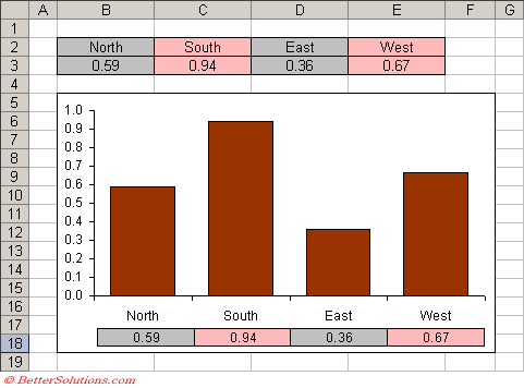 |
You can paste a "static" picture of a range actually into a chart but you cannot paste a "linked" picture.
Step 2 - Insert the Linked Picture
Create the Chart as Usual
Highlight the cell "B3:E3".
Select (Edit > Copy) or use the shortcut key (Ctrl + C) to copy the selection.
Select cell "B20" below the chart.
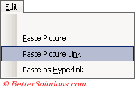
Hold down the Shift key and select (Edit > Paste Picture Link).
 |
Move the picture over the chart and position it below the X-axis.
You can now change the source data and add formatting and the changes will be automatically reflected in this picture.
When you apply a colour to a chart series it must be a solid colour. It is not possible to have a semi transparent colour using the Chart formatting. It is possible by embedding an AutoShape that does have a transparent colour.
To copy a charts format to another chart, click the chart and copy it. Click the other chart, and press (Edit > Paste Special), click Formats.
When you create a chart the following assumption is made for you. If the number of rows in the selected range exceeds the number of columns in the selected range then columns are used for your data series. If the number of columns in the selected range exceeds the number of rows then the rows are used for your data series. This can be changed though (Chart > Source Data)(Data Range tab).
You can include pictures in your charts for series and backgrounds. Copy the shape as a picture. Hold down Shift and press (Edit > Copy Picture) select the data series or corresponding chart and press (Edit > Paste).
To add data to an embedded chart, click the chart and then drag the coloured coded range on the worksheet to include your additional data.
Any colours that are used to format charts must exist on the colour palette. You are therefore restricted to just 64 possible colours per workbook.
Charts display text in several objects. For instance title, axis labels, legend etc. To change the font size of the all the objects select the chart area and change the font here.
Adding up-down bars an drop series and high-low lines to charts
Series lines can be added to connect data series in 2-D stacked bar and column charts.
Drop lines can be added in 2D and 3D area and line charts.
High-low lines and up down bars can be available in 2D line charts. Stack charts already have these on. These can be all be added from the Options tab of Format / Data Series.
Error bars graphically express potential error amounts relative to each data marker in a data series. These can be added to data series in area, bar, column, line, xy(scatter) and bubble charts.
When text is displayed in the legend and on data labels you can force a carriage return by pressing Alt + Enter. You can also use this for text in a cell if the text if pulled from the worksheet
Any formatting applied to axes is also applied to the tick marks. Gridlines can be formatted separately though.
Chart elevation - the height at which you view the chart (in degrees). For 2D charts the range of degrees is -90 to 90. For 3D charts the range of degrees is 0-44. The default value is 15 for most charts,
Chart rotation - applies only to 3D charts. For 3D bar charts range is 0 to 44 and other 3D charts is 0 to 360. Default value is 20
Pie Charts - Limited data labels
When you create a pie chart with the labels and percentages displayed next to each segment there is sometimes not enough room.
The width of each label is fixed and is sometimes not wide enough to display the label in full.
A way round this problem is to convert all the labels to text boxes meaning that the width is not fixed and can be adjusted accordingly.
Line Charts - Displaying an unlimited number of data points on
You should actually use an XY scatter chart instead of a line chart. Set up the data with the dates in one column and values in another as usual. Highlight the first block of data (up to 454 rows).
Create an XY scatter chart and choose to plot lines only, no markers.
Then select the next block of data and copy the selection to the clipboard.
Activate the chart, choose Paste Special and choose "New Series", Values in Columns Categories (X Values) in first column. Repeat this step for an much data as you have.
Bubble Charts - Placing your data labels in a sensible position
General - Adding a single vertical line
There are two ways:
Change the point at which the value(Y) axis crosses the axes. You can specify the exact value or date in Chart Options.
You can also add a new series as column chart. You need to add an additional data series and then lace values the same as the maximum scale.
General - Charting dynamic data over a period containing some #N/As
Plot the chart as normal including the full range (so including the #N/As). #N/As are not actually plotted by the chart so there should be a gap in your chart. In order to remove the gap just change the minimum date value for the x-axis to be the first da
General - Missing X axis labels
If a chart axes will not display a 2000 then you can change the axis type from Time Series to Category and change the "number of categories between tick marks"
© 2026 Better Solutions Limited. All Rights Reserved. © 2026 Better Solutions Limited TopPrevNext