Chart Axes
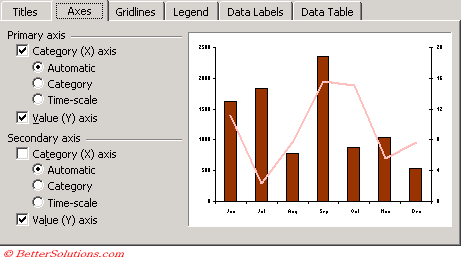 |
In all chart types except for pie and doughnut charts, Excel includes value and category axes by default. Certain chart types include a secondary values axis by default.
Normal Chart - Values = Values()
Normal Chart - X axis label = YValues()
Scatter Chart - Values = Values()
Scatter Chart - Y axis labels = YValues()
If the minimum is more than 5/6 of the maximum, then the Y axis will not start at zero.
For a bar or area chart it can be very misleading and you need to force the axis to start at zero
Automatic
Data with years in one column will be treated as dates and not as a category
In most cases, if your category-axis data consists of dates, Excel recognises that and will automatically apply the "time scaling" as opposed to the "category scaling" to the axis. Time scaling differs from category scaling in the following ways:
This calculation depends on the following:
1) the major unit specified in the scale tab
2) the minimum value
3) the maximum value
When all the numbers are positive, the maximum scale is the first major unit that is greater than or equal to the value returned by this expression:
MAX + 0.05 * (MAX - MIN)
otherwise the maximum scale is the first major unit greater than or equal to the maximum value
but if the difference between the maximum and minimum it greater than 16.667% of the maximum value, the minimum scale is zero.
but if the difference between the maximum and minimum is less than 16.667% of the maximum value, the first major unit that is less than or equal to the value returned by this expression:
MIN - ((MAX - MIN) / 2)
but if the chart is an xy-scatter or bubble chart the minimum scale is the first major unit that is less than or equal to the minimum value.
(taken from Microsoft's Product Support Services Web Site)
To eliminate any minor tick marks on your axes have the same number of minor units as major units.
Your tick marks should always be outside the axes and all axes should be labelled.
To move the x-axis labels to the bottom of a chart if negative numbers are displayed. (Format Axis > Patterns) (tick mark labels to "low").
If a chart should display a number on the x-axis and doesn't then you may need to stretch the chart a little, make it slightly wider.
You can copy a chart's data and formats to another chart. Select the chart, copy it, select the other chart and paste ??
To use the layout of the current chart for all new charts, select (Chart > Chart Type) and set as default on the Custom tab).
It is possible to have category labels that are numeric when you want to display yearly data.
If your category labels are numeric and you have a heading above it then Excel will automatically think that this is a separate series. To get round this problem, just remove the heading.
When a chart is selected the "Sheet tab" on the (File > Properties) dialog box changes to "Chart". This is obviously chart specific letting you change both size and quality when the chart is printed.
An XY Scatter chart is also commonly known as a scatter gram or scatter plot chart
A Gantt chart is a horizontal bar chart that is frequently used to provide a graphical illustration of a schedule and helps you coordinate and track specific tasks in a project.
It is possible that a chart can have two vertical axes. These are called values axes and each one can have a different scale.
Important
The x-axis for a chart can have either a Category axis or Time Series axis. Even though it says time-scale it is really a date series as any time components in a date are ignore and midnight is always plotted ?? No partial days are considered.
© 2026 Better Solutions Limited. All Rights Reserved. © 2026 Better Solutions Limited TopPrevNext