Frequency Chart
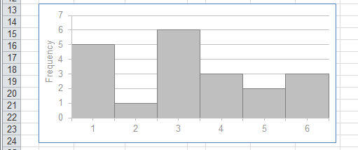
Lets suppose we throw a dice 20 times and write down the number that is on the top.
{4,2,1,6,3,4,3,3,5,1,3,4,1,6,5,1,3,6,1,3}
We can construct a frequency table to show the results of this experiment.
The data in a frequency table can be quickly summarised by plotting a column chart.
 |
Grouped Frequency Distribution
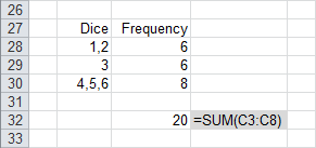
When you have a large amount of data you might want to group the data into categories (or intervals).
Lets consider that we only wanted to show 3 bars on our column chart. We could group the results in the following way
 |
The data in this table can be quickly summarised by plotting a column chart.
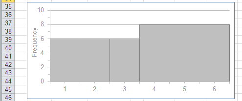 |
Now this chart looks totally different to the first one and is very misleading.
This chart seems to indicate that the numbers that occurred the most were 4, 5 and 6.
To rectify this problem instead of plotting a column chart we can plot a histogram instead.
Histogram
A histogram is an accurate way of representing a frequency distribution.
A histogram is a column chart with two important criteria:
1) There are no gaps between the columns.
2) The intervals must be the same width meaning the area underneath is proportional to the frequency.
Plotting a histogram of the grouped frequency distribution looks like this:
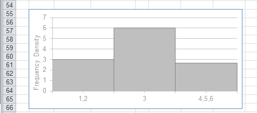 |
Notice that the y-axis has been changed to frequency density.
 |
Cumulative Frequency Distribution
These are useful to show what proportion of a dataset lies above or below certain limits
Interval | Frequency | Cumulative f | Cumulative %
What percentage of this dataset scored over 41%
Percentiles are points on a frequency distribution below which a specified percentage of cases in the distribution fall
The 25th, 50th and 75th percentiles are referred to as quartiles
For more details about percentiles, please refer to Excel > Add-ins > Analysis ToolPak > Rank and Percentile
Frequency Polygon
A grouped frequency distribution can be displayed as a frequency polygon.
To construct a frequency polygon you must calculate the midpoint of each interval:
 |
These midpoints are then joined together with straight lines to form a polygon.
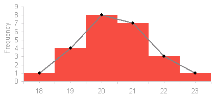 |
The area under a frequency polygon is the same as the area under the original histogram
Frequency Curve
When you have a large number of intervals the frequency polygon can be smoothed out to create a frequency curve.
It is often easier to see the shape of a distribution by using a frequency curver.
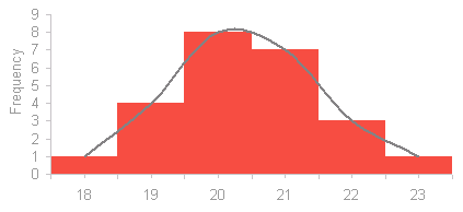 |
This distribution is slightly skewed.
Frequency Distribution Equation
When your data is in the form of a frequency distribution, the formula becomes:
 |
and the alternative formula becomes:
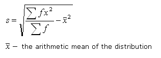 |
When a frequency distribution is normally distributed we can find out the probability of a value by standardising the values.
Distribution Shapes
A good use of the frequency polygon is to categorise the shape of the distribution in terms of the degree of symmetry
A perfectly balanced distribution is called symmetrical.
right skewed, left skewed
© 2026 Better Solutions Limited. All Rights Reserved. © 2026 Better Solutions Limited TopPrevNext