Button (btn)
 | Button - Allows the user to run a separate subroutine. |
A Button can be clicked by using the mouse, ENTER key, or SPACEBAR if the button has focus.
Set the AcceptButton or CancelButton property of a Form to allow users to click a button by pressing the ENTER or ESC keys even if the button does not have focus.
When you display a form using the ShowDialog method, you can use the DialogResult property of a button to specify the return value of ShowDialog.
You can change the button's appearance. For example, to make it appear flat for a Web look, set the FlatStyle property to FlatStyle.Flat. The FlatStyle property can also be set to FlatStyle.Popup, which appears flat until the mouse pointer passes over the button; then the button takes on the standard Windows button appearance.
If the control that has focus accepts and processes the ENTER key press, the Button does not process it. For example, if a multiline TextBox or another button has focus, that control processes the ENTER key press instead of the accept button.
Examples
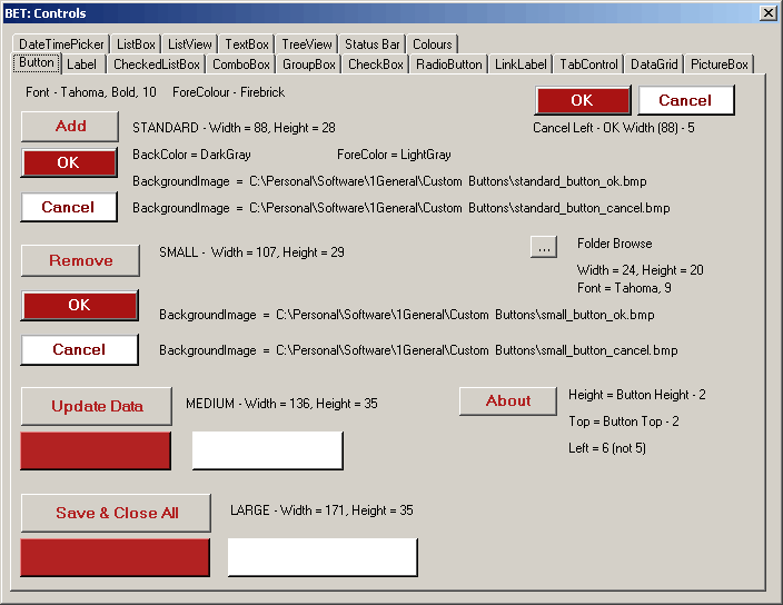 |
Button Conventions
| OK | means save and close |
| Save | means save and don't close |
| Save & Close | means save and close |
| Cancel | close without saving changes |
| Apply | means save and don't close |
| Close | close without saving changes |
Useful Code
This allows you to change the background colour of the button dynamically using a RGB value.
this.btnOK.BackColor = System.Drawing.Color.FromArgb(giCOLOUR_RED, giCOLOUR_GREEN, giCOLOUR_BLUE);
Escape key does not work unless the button is visible
this.btnCancel.Top = Me.btnCancel.Top + 100;
Calling a Button_Click
this.btnButton_Click(sender, New System.EventArgs())
Adding a ToolTip
Drag the tooltip control to the Designer Tray underneath your form.
Once added every control will acquire a "tooltip on tooltip1' property
Properties
| AutoEllipsis | Gets or sets a value indicating whether the ellipsis character (...) appears at the right edge of the control, denoting that the control text extends beyond the specified length of the control. (Inherited from ButtonBase.) |
| AutoSize | Gets or sets a value that indicates whether the control resizes based on its contents. (Inherited from ButtonBase.) |
| AutoSizeMode | Gets or sets the mode by which the Button automatically resizes itself. |
| BackColor | Gets or sets the background color of the control. (Inherited from ButtonBase.) |
| DefaultImeMode | Gets the default Input Method Editor (IME) mode supported by this control. (Inherited from ButtonBase.) |
| DefaultSize | (Inherited from ButtonBase.) |
| DialogResult | Gets or sets a value that is returned to the parent form when the button is clicked. |
| FlatAppearance | Gets the appearance of the border and the colors used to indicate check state and mouse state. (Inherited from ButtonBase.) |
| FlatStyle | Gets or sets the flat style appearance of the button control. (Inherited from ButtonBase.) |
| Image | Gets or sets the image that is displayed on a button control. (Inherited from ButtonBase.) |
| ImageAlign | Gets or sets the alignment of the image on the button control. (Inherited from ButtonBase.) |
| ImageIndex | Gets or sets the image list index value of the image displayed on the button control. (Inherited from ButtonBase.) |
| ImageKey | Gets or sets the key accessor for the image in the ImageList. (Inherited from ButtonBase.) |
| ImageList | Gets or sets the ImageList that contains the Image displayed on a button control. (Inherited from ButtonBase.) |
| ImeMode | Gets or sets the Input Method Editor (IME) mode supported by this control. This property is not relevant for this class. (Inherited from ButtonBase.) |
| IsDefault | Gets or sets a value indicating whether the button control is the default button. (Inherited from ButtonBase.) |
| Text | (Inherited from ButtonBase.) |
| TextAlign | Gets or sets the alignment of the text on the button control. (Inherited from ButtonBase.) |
| TextImageRelation | Gets or sets the position of text and image relative to each other. (Inherited from ButtonBase.) |
| UseCompatibleTextRendering | Gets or sets a value that determines whether to use the compatible text rendering engine (GDI+) or not (GDI). (Inherited from ButtonBase.) |
Methods
| CreateAccessibilityInstance | (Inherited from ButtonBase.) |
| Dispose | Overloaded. Releases the resources used by the ButtonBase. (Inherited from ButtonBase.) |
| GetPreferredSize | Retrieves the size of a rectangular area into which a control can be fitted. (Inherited from ButtonBase.) |
| NotifyDefault | Notifies the Button whether it is the default button so that it can adjust its appearance accordingly. |
| PerformClick | Generates a Click event for a button. |
| ToString | Overridden. |
Events
| AutoSizeChanged | Occurs when the value of the AutoSize property changes. (Inherited from ButtonBase.) |
| DoubleClick | Occurs when the user double-clicks the Button control. |
| MouseDoubleClick | Occurs when the user double-clicks the Button control with the mouse. |
© 2024 Better Solutions Limited. All Rights Reserved. © 2024 Better Solutions Limited TopPrevNext