DateTimePicker (dtp)
 | DateTimePicker - Allows the user to select a specific date and/or time. |
This prompts the user for a date or time using a graphical calendar with scroll bars.
This control actually exists of two parts.
A label that displays the selected date and a popup calendar that allows the user to select a date.
Examples
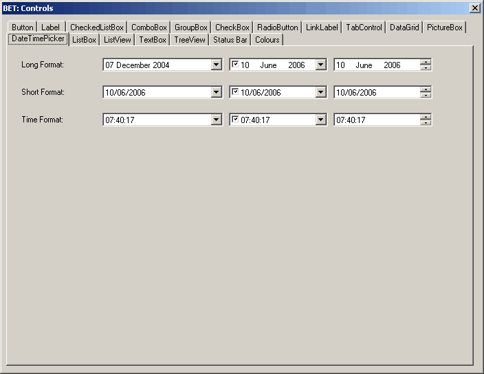 |
Date Formats
Long Format can be different on different PCs and depends on the settings in the (Start > Control Panel > Regional and Language Options)
the default is "dd MMMM yyyy"
Short format default is "dd/mm/yyyy"
Time format default is HH:mm:ss
Getting the Value
string theDate;
theDate = this.dtpMyDate.Value.ToString("dd/mm/yy");
Useful Code
If chbSaveDate.Checked = True Then
    dtpDateTimePicker.Text = App_RegDialogNewDocumentSaveDateValueRead()
Else
   dtpDateTimePicker.Value = New System.DateTime(2005, 1, 1)
   dtpDateTimePicker.Value = System.DateTime.Now
   dtpDateTimePicker.Value = System.DateTime.Now().AddDays(-1)
End If
If you want to initialise to todays date you do not need to instantiate a new variable.
dtpDateTimePicker.Value = System.DateTime.Now
dtpDateTimePicker.MinDate = New DateTime(2000,6,24)
dtpDateTimePicker.MaxDate = New DateTime(2000,6,24)
dtpDateTimePicker.CustomFormat = "MMMM dd yy"

Dim sdateformat As String
sdateformat = Me.dtpIssueDateLogged.Text
Always specify the actual "Date" at the end because otherwise the time will be included
dtpDateFrom.MaxDate = System.DateTime.Now().AddDays(-1).Date
dtpDateTo.MaxDate = System.DateTime.Now().AddDays(-1).Date
'other code
dtpDateTo.Value = System.DateTime.Now().AddDays(-1).Date
Displaying the date, but setting a time
Me.dtpDate.Value = New System.DateTime(Me.dtpDate.Value.Year, Me.dtpDate.Value.Month, Me.dtpDate.Value.Day, CType("time value",Integer), CType("time value",Integer))
Properties
| BackColor | Overridden. Gets or sets a value indicating the background color of the DateTimePicker control. |
| BackgroundImage | Overridden. Gets or sets the background image for the control. |
| BackgroundImageLayout | Overridden. Gets or sets the layout of the background image of the DateTimePicker control. |
| CalendarFont | Gets or sets the font style applied to the calendar. |
| CalendarForeColor | Gets or sets the foreground color of the calendar. |
| CalendarMonthBackground | Gets or sets the background color of the calendar month. |
| CalendarTitleBackColor | Gets or sets the background color of the calendar title. |
| CalendarTitleForeColor | Gets or sets the foreground color of the calendar title. |
| CalendarTrailingForeColor | Gets or sets the foreground color of the calendar trailing dates. |
| Checked | Gets or sets a value indicating whether the Value property has been set with a valid date/time value and the displayed value is able to be updated. |
| CustomFormat | Gets or sets the custom date/time format string. |
| DropDownAlign | Gets or sets the alignment of the drop-down calendar on the DateTimePicker control. |
| ForeColor | Overridden. Gets or sets the foreground color of the DateTimePicker control. |
| Format | A DateTimePicker value that specifies if the format is Long, Short, Time or Custom. The default is Long. |
| MaxDate | Gets or sets the maximum date and time that can be selected in the control. Read Only indicating the maximum date supported |
| MaximumDateTime | Gets the maximum date value allowed for the DateTimePicker control. |
| MinDate | Gets or sets the minimum date and time that can be selected in the control. Read Only indicating the minimum date supported |
| MinimumDateTime | Gets the minimum date value allowed for the DateTimePicker control. |
| Padding | Gets or sets the spacing between the contents of the DateTimePicker control and its edges. |
| PreferredHeight | Gets the preferred height of the DateTimePicker control. |
| RightToLeftLayout | Gets or sets whether the contents of the DateTimePicker are laid out from right to left. |
| ShowCheckbox | Displays a checkbox to the left of the date in the control. When the checkbox is selected the date/time can be updated. Gets or sets a value indicating whether a check box is displayed to the left of the selected date. |
| ShowUpDown | Gets or sets a value indicating whether a spin button control (also known as an up-down control) is used to adjust the date/time value. |
| Text | Returns a String object that represents the selected date |
| Value | Returns a DateTime object that represents the selected date |
Methods
| CreateAccessibilityInstance | Overridden. Creates a new accessibility object for the DateTimePicker control. |
| OnDropDown | Raises the DropDown event. |
| ToString | Overridden. Returns a string that represents the current DateTimePicker control. |
Events
| BackColorChanged | Occurs when the value of the BackColor property changes. |
| BackgroundImageChanged | Occurs when the value of the BackgroundImage property changes. |
| BackgroundImageLayoutChanged | Occurs when the value of the BackgroundImageLayout property changes. |
| CloseUp | Occurs when the drop-down calendar is dismissed and disappears. |
| DoubleClick | Occurs when the control is double-clicked. |
| DropDown | Occurs when the drop-down calendar is shown. |
| FormatChanged | Occurs when the Format property value has changed. |
| MouseClick | Occurs when the control is clicked with the mouse. |
| MouseDoubleClick | Occurs when the control is double-clicked with the mouse. |
| PaddingChanged | Occurs when the value of the Padding property changes. |
| TextChanged | Occurs when the value of the Text property changes. |
| ValueChanged | Occurs when the Value property changes. (user selected a new date) |
© 2024 Better Solutions Limited. All Rights Reserved. © 2024 Better Solutions Limited TopPrevNext