CheckBox (chb)
 | CheckBox - Allows the user to select or deselect an option. |
The CheckedChange event does not fire if you set the value to False when the form loads.
Examples
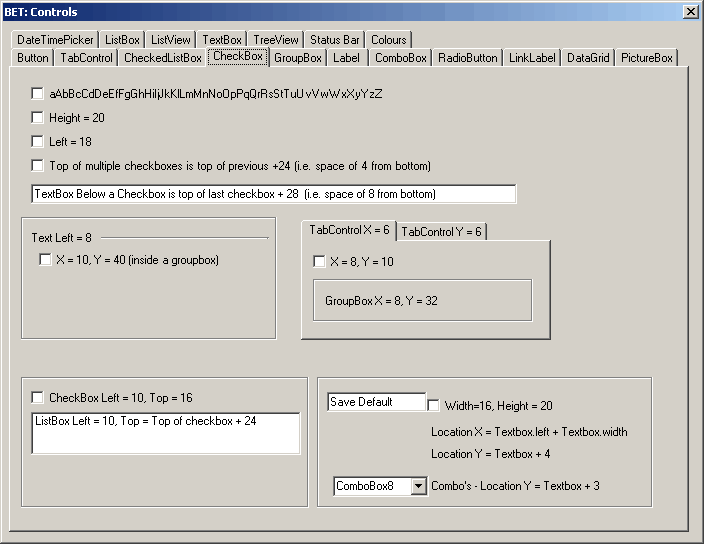 |
Useful Code
if (this.CheckBox1.Checked == false)
{
   this.CheckBox1.Checked = true;
}
this.Checkbox1.CheckState
Properties
| Appearance | Gets or sets the value that determines the appearance of a CheckBox control. |
| AutoCheck | Gets or set a value indicating whether the Checked or CheckState values and the CheckBox's appearance are automatically changed when the CheckBox is clicked. |
| AutoEllipsis | Gets or sets a value indicating whether the ellipsis character (...) appears at the right edge of the control, denoting that the control text extends beyond the specified length of the control. (Inherited from ButtonBase.) |
| AutoSize | Gets or sets a value that indicates whether the control resizes based on its contents. (Inherited from ButtonBase.) |
| BackColor | Gets or sets the background color of the control. (Inherited from ButtonBase.) |
| CheckAlign | Gets or sets the horizontal and vertical alignment of the check mark on a CheckBox control. |
| Checked | Gets or set a value indicating whether the CheckBox is in the checked state. |
| CheckState | Gets or sets the state of the CheckBox. |
| DefaultImeMode | Gets the default Input Method Editor (IME) mode supported by this control. (Inherited from ButtonBase.) |
| FlatAppearance | Gets the appearance of the border and the colors used to indicate check state and mouse state. (Inherited from ButtonBase.) |
| FlatStyle | Gets or sets the flat style appearance of the button control. (Inherited from ButtonBase.) |
| Image | Gets or sets the image that is displayed on a button control. (Inherited from ButtonBase.) |
| ImageAlign | Gets or sets the alignment of the image on the button control. (Inherited from ButtonBase.) |
| ImageIndex | Gets or sets the alignment of the image on the button control. (Inherited from ButtonBase.) |
| ImageKey | Gets or sets the key accessor for the image in the ImageList. (Inherited from ButtonBase.) |
| ImageList | Gets or sets the ImageList that contains the Image displayed on a button control. (Inherited from ButtonBase.) |
| IsDefault | Gets or sets a value indicating whether the button control is the default button. (Inherited from ButtonBase.) |
| Text | (Inherited from ButtonBase.) |
| TextAlign | Overridden. Gets or sets the alignment of the text on the CheckBox control. |
| ThreeState | Gets or sets a value indicating whether the CheckBox will allow three check states rather than two. |
| UseCompatibleTextRendering | Gets or sets a value that determines whether to use the compatible text rendering engine (GDI+) or not (GDI). (Inherited from ButtonBase.) |
| UseMnemonic | Gets or sets a value indicating whether an ampersand (&) is included in the text of the control. (Inherited from ButtonBase.) |
| UseVisualStyleBackColor | Gets or sets a value that determines if the background is drawn using visual styles, if supported. (Inherited from ButtonBase.) |
Methods
| CreateAccessibilityInstance | Overridden. Creates a new accessibility object for the CheckBox control. |
| Dispose | Overloaded. Releases the resources used by the ButtonBase. (Inherited from ButtonBase.) |
| GetPreferredSize | Retrieves the size of a rectangular area into which a control can be fitted. (Inherited from ButtonBase.) |
| OnClick | Overridden. Raises the Click event. |
| ToString | Overridden. Returns a string that represents the current CheckBox control. |
Events
| AutoSizeChanged | Occurs when the value of the AutoSize property changes. (Inherited from ButtonBase.) |
| CheckedChanged | Occurs when the value of the Checked property changes. |
| CheckStateChanged | Occurs when the value of the CheckState property changes. |
| DoubleClick | Occurs when the user double-clicks the CheckBox control. |
| ImeModeChanged | Occurs when the ImeMode property is changed. This event is not relevant for this class. (Inherited from ButtonBase.) |
| MouseDoubleClick | Occurs when the user double-clicks the CheckBox control. |
© 2024 Better Solutions Limited. All Rights Reserved. © 2024 Better Solutions Limited TopPrevNext