RadioButton (rad)
 | RadioButton - Allows the user to select from a list of possible distinct options. |
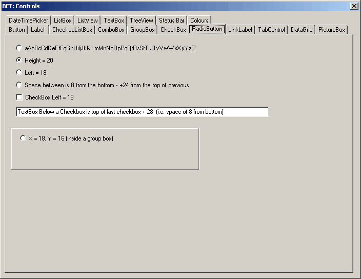
Radio buttons are also called Option Buttons
These are similar to checkboxes because the user can select and deselect them.
You normally use checkboxes in groups
Disable group box if radio buttons take a while or fire web services
Checkboxes work independently, but radiobuttons are intented to work in a group.
When you select one radio button in a group, the others are automatically deselected.
Radiobuttons allow the user to select one of a set of exclusaive options
All radiobuttons in a given container such as a form make a group
Radiobuttons can display text an image or both
In addition a radio's button appearance may be altered to appear as a toggle style button by changing the Appearance property.
Examples
 |
Useful Code
Properties
| Appearance | Gets or sets a value determining the appearance of the RadioButton. |
| AutoCheck | Gets or sets a value indicating whether the Checked value and the appearance of the control automatically change when the control is clicked. |
| AutoEllipsis | Gets or sets a value indicating whether the ellipsis character (...) appears at the right edge of the control, denoting that the control text extends beyond the specified length of the control. (Inherited from ButtonBase.) |
| AutoSize | Gets or sets a value that indicates whether the control resizes based on its contents. (Inherited from ButtonBase.) |
| BackColor | Gets or sets the background color of the control. (Inherited from ButtonBase.) |
| BackgroundImage | Gets or sets the background image displayed in the control. (Inherited from Control.) |
| BackgroundImageLayout | Gets or sets the background image layout as defined in the ImageLayout enumeration. (Inherited from Control.) |
| CheckAlign | Gets or sets the location of the check box portion of the RadioButton. |
| Checked | Gets or sets a value indicating whether the control is checked. |
| DefaultImeMode | Gets the default Input Method Editor (IME) mode supported by this control. (Inherited from ButtonBase.) |
| DefaultSize | Overridden. |
| FlatAppearance | Gets the appearance of the border and the colors used to indicate check state and mouse state. (Inherited from ButtonBase.) |
| FlatStyle | Gets or sets the flat style appearance of the button control. (Inherited from ButtonBase.) |
| ForeColor | Gets or sets the foreground color of the control. (Inherited from Control.) |
| Image | Gets or sets the image that is displayed on a button control. (Inherited from ButtonBase.) |
| ImageAlign | Gets or sets the alignment of the image on the button control. (Inherited from ButtonBase.) |
| ImageIndex | Gets or sets the image list index value of the image displayed on the button control. (Inherited from ButtonBase.) |
| ImageKey | (Added 2.0) Gets or sets the key accessor for the image in the ImageList. (Inherited from ButtonBase.) |
| ImageList | Gets or sets the ImageList that contains the Image displayed on a button control. (Inherited from ButtonBase.) |
| IsDefault | Gets or sets a value indicating whether the button control is the default button. (Inherited from ButtonBase.) |
| Text | (Inherited from ButtonBase.) |
| TextAlign | Overridden. Gets or sets the alignment of the text on the RadioButton control. |
| UseCompatibleTextRendering | Gets or sets a value that determines whether to use the compatible text rendering engine (GDI+) or not (GDI). (Inherited from ButtonBase.) |
| UseMnemonic | Gets or sets a value indicating whether an ampersand (&) is included in the text of the control. (Inherited from ButtonBase.) |
| UseVisualStyleBackColor | Gets or sets a value that determines if the background is drawn using visual styles, if supported. (Inherited from ButtonBase.) |
Methods
| CreateAccessibilityInstance | Overridden. Creates a new accessibility object for the RadioButton control. |
| Dispose | Overloaded. Releases the resources used by the ButtonBase. (Inherited from ButtonBase.) |
| GetPreferredSize | Retrieves the size of a rectangular area into which a control can be fitted. (Inherited from ButtonBase.) |
| ToString | Overridden. Overrides the ToString method. |
Events
| AppearanceChanged | Occurs when the Appearance property value changes. |
| AutoSizeChanged | Occurs when the value of the AutoSize property changes. (Inherited from ButtonBase.) |
| CheckedChanged | Occurs when the value of the Checked property changes. |
| Click | Occurs when the control is clicked. (Inherited from Control.) |
| DoubleClick | Occurs when the user double-clicks the RadioButton control. |
| MouseDoubleClick | Occurs when the user double-clicks the RadioButton control with the mouse. |
private void radRadioButton1_CheckedChanged(object sender, System.EventArgs e)
{

}
© 2024 Better Solutions Limited. All Rights Reserved. © 2024 Better Solutions Limited TopPrevNext