Using the Chart Wizard
Removed in 2007
You can display the chart wizard by either selecting (Insert > Chart) or by pressing the chart wizard button on the standard toolbar.
 | Chart Wizard - Displays the (Insert > Chart) dialog box. |
The chart wizard is a series of dialog boxes which lets you make decisions regarding the chart you want to create.
There are four steps in the wizard which allow you to change the chart type, source data, chart options and location of your chart.
Step 1 - Chart Type - Lets you choose from the 14 different standard types of chart. Below the list of chart subtypes on the right hand side is a brief description to help you choose the right chart. There is also a "Press and Hold to View Sample" button that will display a preview of how the chart will look.
Step 2 - Source Data - Lets you select the cells and define the range to use for the chart. You can also choose whether you want to plot columns or rows as your data series. There are two tabs "Data Range" and "Series". The Series tab splits up the actual data range into individual series.
Step 3 - Options - Lets you define certain options for the chart (i.e. titles, axes, gridlines, legend, data labels and data table). This also displays a preview of how the chart will look.
Step 4 - Location - Lets you decide whether to display the chart on a separate chart sheet or as an embedded object on the active worksheet.
The advantage of using the Chart Wizard is that you can easily go back and change any of the options before you actually create the chart.
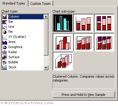
Step 1 - Chart Type
The advantage of using the Chart Wizard is that you can easily go back and change any of the options before you actually create the chart.
Lets you choose from the 14 different standard types of chart. Below the list of chart subtypes on the right hand side is a brief description to help you choose the right chart. There is also a "Press and Hold to View Sample" button that will display a preview of how the chart will look.
 |
Step 2 - Chart Source Data
Lets you select the cells and define the range to use for the chart. You can also choose whether you want to plot columns or rows as your data series. There are two tabs "Data Range" and "Series". The Series tab splits up the actual data range into individual series.
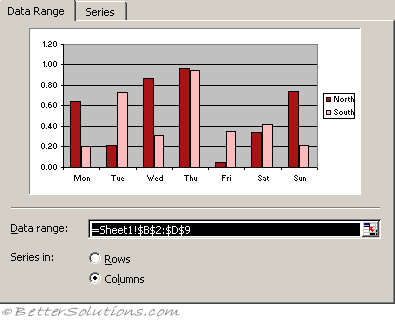 |
Excel will normally default to plotting your series by row although it actually depends on the shape of your data.
If your data has an equal number of rows and columns or has more columns than rows then your series are plotted in rows.
If your data is non-contiguous then this can vary.
To help you to identify the correct range you can use the button on the right of the Data Range textbox to minimise the dialog box. You can display the whole dialog box again by selecting the button a second time.
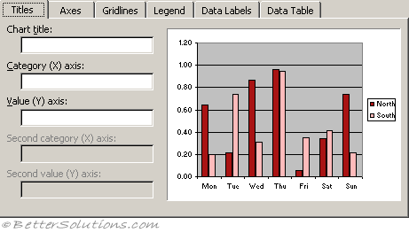
Step 3 - Chart Options
Lets you define certain options for the chart (i.e. titles, axes, gridlines, legend, data labels and data table). This also displays a preview of how the chart will look.
 |
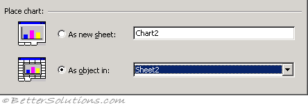
Step 4 - Chart Location
Lets you decide whether to display the chart on a separate chart sheet or as an embedded object on the active worksheet.
 |
© 2026 Better Solutions Limited. All Rights Reserved. © 2026 Better Solutions Limited TopPrevNext