Chart Types - Changing
Removed in 2007
There are three ways you can change the chart type after the chart has been created.
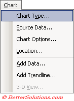
1) Using the (Chart > Chart Type) menu.
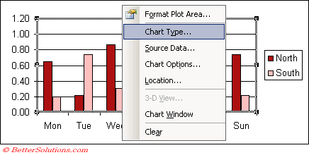
2) Using the Chart Shortcut Menu and selecting Chart Type.
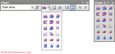
3) Using the Chart Toolbar drop-down list.
Using the (Chart > Chart Type) menu
When you activate a chart the Data specifc drop-down menu is automatically replaced with a Chart drop-down menu.
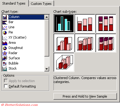
You can change the chart type of an existing chart by selecting (Chart > Chart Type). This will display the Chart Type dialog box.
 |
The chart types that are available are listed on the left hand side and each type contains several sub-types which are listed on the right hand side.
Below the list of chart subtypes on the right hand side is a brief description to help you identify the right chart type to use.
There is also a "Press and Hold to View Sample" button that will display a preview of how the chart will look.
 |
There are actually two tabs but we will only discuss the "Standard Types" tab here.
Custom chart types are more complicated and are discussed later. Please refer to the Custom Chart Types page for more details.
Using the Shortcut Menu
You can also change the chart type by using the Chart shortcut menu.
Clicking anywhere on a chart with the Right mouse button will display the shortcut menu.
The shortcut menu which is displayed when you select either the Chart Area, Plot Area or an individual Data Series will allow you to change the chart type.
This will display the above Chart Type dialog box.
 |
Using the Chart Toolbar
When you activate a chart the Chart toolbar will be displayed automatically.
You can also change the chart type using the Chart Type drop-down menu on the Chart toolbar.
This drop-down menu is actually a floating toolbar that can be separated to create a separate Chart Type toolbar.
The chart type that is displayed on the toolbar is the last chart type that you used.
 |
If the Chart toolbar is not displayed when you activate a chart you can select (View > Toolbars > Chart) to display it.
Important
Be careful that when you select a different chart type you may lose some (or all) of your customisations.
Bar charts are just column charts that appear horizontally as opposed to vertically.
Scatter charts are also commonly known as correlation charts, since they indicate a correlation, a relationship of "cause and effect".
If a chart has two data series, each series can have a different chart type.
Excel can only create a chart using data that it recognises as numerical.
© 2026 Better Solutions Limited. All Rights Reserved. © 2026 Better Solutions Limited TopPrevNext