Histogram
A histogram is basically a set of totals for values in particular ranges.
A histogram is a chart (usually a simple column chart) that takes a collection of measurements and plots the number of measurements (called the frequency) that fall within each of several intervals (called bins).
For example, a histogram can show you exactly how the test scores of all students who took a test measure up
It's important that the input range for a histogram contains quantitative numeric data (such as the test scores); the Histogram tool doesn't work with qualitative numeric data
Using Histograms
One of the options is to have a chart generated with the output.
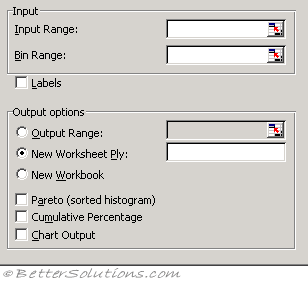 |
Input Range - Enter the cell reference for the range of data you want to analyse.
Bin Range (optional) - Enter the cell reference to a range that contains an optional set of boundary values that define bin ranges. These values should be in ascending order. Microsoft Excel counts the number of data points between the current bin number and the adjoining higher bin, if any. A number is counted in a particular bin if it is equal to or less than the bin number down to the last bin. All values below the first bin value are counted together, as are the values above the last bin value.
If you omit the bin range, Excel creates a set of evenly distributed bins between the data's minimum and maximum values.
Labels - Select if the first row or column of your input range contains labels. Clear this check box if your input range has no labels; Excel generates appropriate data labels for the output table.
Output Range - Enter the reference for the upper-left cell of the output table. Excel automatically determines the size of the output area and displays a message if the output table will replace existing data.
New Worksheet Ply - Click to insert a new worksheet in the current workbook and paste the results starting at cell A1 of the new worksheet. To name the new worksheet, type a name in the box.
New Workbook - Click to create a new workbook and paste the results on a new worksheet in the new workbook.
Pareto (sorted histogram) - Select to present data in the output table in descending order of frequency. If this check box is cleared, Excel presents the data in ascending order and omits the three rightmost columns that contain the sorted data.
Cumulative Percentage - Select to generate an output table column for cumulative percentages and to include a cumulative percentage line in the histogram chart. Clear to omit the cumulative percentages.
Chart Output - Select to generate an embedded histogram chart with the output table.
The Histogram analysis tool calculates individual and cumulative frequencies for a cell range of data and data bins. This tool generates data for the number of occurrences of a value in a data set.
For example, in a class of 20 students, you could determine the distribution of scores in letter-grade categories. A histogram table presents the letter-grade boundaries and the number of scores between the lowest bound and the current bound. The single most-frequent score is the mode of the data.
Important
You can also use the FREQUENCY function.
© 2026 Better Solutions Limited. All Rights Reserved. © 2026 Better Solutions Limited TopPrevNext